

Recently, we were discussing the various BI platforms we have used for projects here at Haystack, and I was pondering whether we could find any data that would be directional on their volume of use. I’d looked at the Gartner Magic quadrant for BI solutions earlier that day, which sparked the conversation. I was going about my day and did a quick web search and an answer on Stack Overflow was among the top results. Then it hit me. Stack Overflow provides access to their forum data. You can query any of the Stack Exchange ecosystem of sites over at data.stackexchange.com
The process is straightforward to anyone with a passing familiarity with SQL. Posts are usually tagged by the user with the relevant programming language or software that they are enquiring about. Within short order I had a simple query that returned all the data I wanted. Any query made on data.stackexchange.com is publicly visible and mine is here. Or below for your convenience.

Why the 6 above? Qlik, Tableau and Power BI are all leaders in Gartners 2018 Magic Quadrant for Business Intelligence. I also wanted to check on a few other tools we often use here at Haystack: Alteryx (which is a data science and machine learning magic quadrant leader), Klipfolio, and Periscope Data. I checked a few other softwares by looking at the Tags table, but nothing seemed to pop. The R based Shiny was hot, but that is more of a raw programming visualization system, who’s natural home is Stack Overflow. The above 6 are all more unusual for Stack Overflow.
The data returned by a query from data.stackexchange.com can be downloaded as a csv. Now that I had my data, I needed to decide what platform I wanted to use to visualize and explore the data.
Here is my initial overview klip:
Stack Overflow Posts about BI Tools
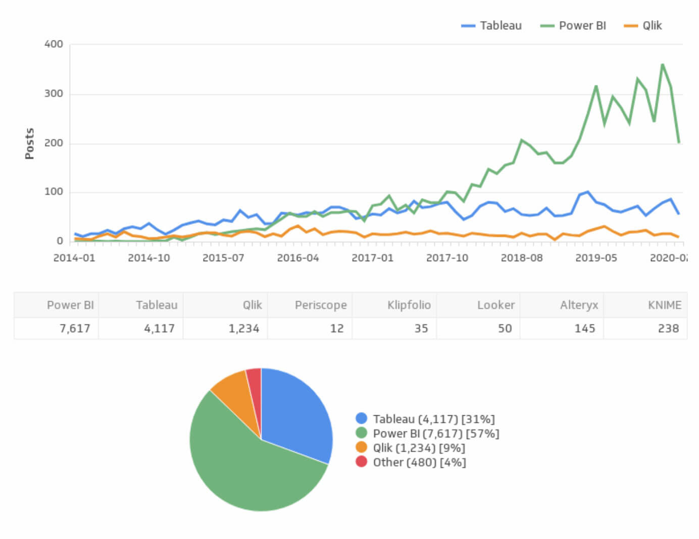
A full interactive dashboard is here.
What meaning can we extract from this? While Tableau leads the pack early on (note the line chart starts in 2014, though the full dataset goes back to 2009), in Q3 of 2017 Power BI shot ahead. Qlik places in third, and the other three softwares we checked are rare enough that they didn’t make sense to create a line on the line chart for. Power BI is the newest of the three, and seems to have achieved considerable momentum. This growth is likely do to Power BI being packaged into many Business MS Office 365.
None of these platforms natural home is Stack Overflow. All are proprietary softwares with no open source variant and boast considerable community support forums and knowledge bases maintained by each respective software company. This explains the overall low numbers and should remind us to look at this only directionally.
Periscope Data and Klipfolio are significantly newer products than the other 4. Both are entirely cloud based platforms. You can easily open a chat window and get direct support from the software vendor while you are working on a visual. This likely lowers the number of questions that hit Stack Overflow for both of these platforms. Most questions that emerge for Periscope are likely SQL questions, where Periscope would not need to be a tag. Similarly, for Klipfolio plenty of questions will be about the specifics of connecting and working with a particular API, where again the Klipfolio tag may not be as relevant.
The big surprise for me is Alteryx. I first worked with Alteryx in 2010, and it first launched in 2006 so the platform isn’t new. But it is also the black sheep of this analysis, as it is not fundamentally a data viz tool. Rather it is a impressively flexible ETL tool with spatial and predictive modeling, and some minor visualization and report generation capabilities. It can read and write directly to databases, and pairs well with strong dashboard software like Tableau. (Alteryx can prep data and publish directly to Tableau hyper files, Tableau Online and Server and can also do similar things for both Qlik and Power BI.)
I am not surprised that it has a noticeably smaller (inferred) user base then say Tableau. Alteryx isn’t really the type of tool to garner a lot of casual users. However, the magnitude of the drop is surprising.
Why Klipfolio
With a plethora of business intelligence tools out there, why might you chose Klipfolio?
One of the things we run into a lot at Haysatck is clients wanting to grab data from some cloud-based platform like a CRM (Salesforce, Pipedrive) or an email campaign system (MailChimp, ActiveCampaign, Aweber). With Klipfolio this is easy – they have prebuilt connectors and simple klips (visuals) for all of these platforms and many more.
You may want to look at the success of your email campaign in driving up web traffic (Google Analytics) and tie that to activity on LinkedIn, while also looking at your sales pipeline. You can do that in Klipfolio all in one dashboard. With a clever developer you can even build KPIs and visualize them with data from many platforms such as rolling online add spend vs sales.
Any platform that has an appropriate API can be connected to in Klipfolio and maintain a live stream of fresh data. Depending on the visual you may have it refresh every 15 minutes, or even more frequently. Part of the reason it’s easy to work with API data in Klipfolio is because it easily handles what they normally return – JSON data. In most other popular BI platforms connecting to API data from your cloud based platforms ranges from much more difficult to impossible.
Klipfolio itself is entirely cloud-based. (Our three leaders above are all partially cloud-based.) All you need to use Klipfolio is a web-browser and a good internet connection. I’ve focussed on the API data aspect but Klipfolio also connects to databases and flat files. Below we walk you through building a simple multi-chart Klip using a csv.
If you are interested in Klipfolio contact us and we can set you up with a 14-day free trial. You can build your own and we’ll be happy to assit in setting up Klipfolio dashboards for you.
How To in Klipfolio
Want to build something like this in Klipfolio? Here’s a quick step by step of how we did it.
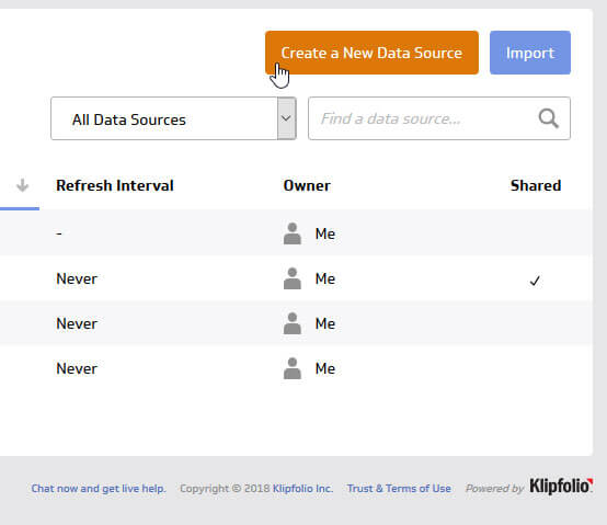
1. Create Datasource
In this case we are using a csv file downloaded from data.stackexchange.com
In Klipfolio go to Data Sources -> Create a New Data Source
This brings up the connection page, at the top right click Upload a File
Upload your csv and call it “StackO Tags”
2. Create a New Klip
We’ll create a new klip using the StackO Tags dataset. I often start with a simple table to make sure I am building my formulas correctly.
In Klipfolio go to Klips -> Build a Custom Klip
This brings up the klip editor:
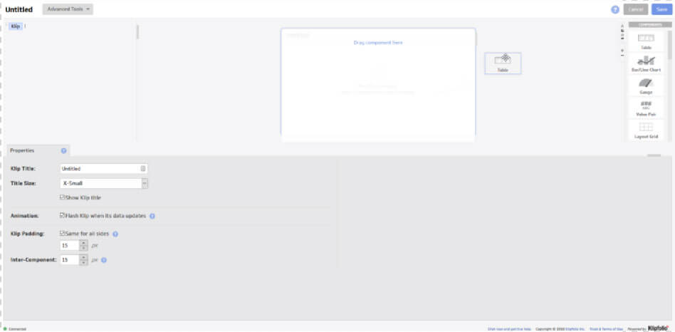
Rename your klip: “Stack O Posts” and click save. This will bring you to a meta data page, add a description if you wish, click finish. This will return you to the list of all your klips, click on Stack O Post -> Edit Klip. This will return you to the klip editor.
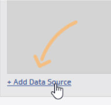
Grab a “Table” from the component list on the right and drag it to the central canvas. As soon as you’ve done that you’ll see an add data source on the bottom left. Click it, and pick the “StackO Tags” dataset you created from the list of datasources.
Note that you can add multiple datasets to a klip and use all of those datasources in a single klip. There is a tabbed menu that lets you do so, and let’s you switch between data “sheets.” For our analysis we only have one dataset.
3. Basic Formulas in our Table
Building visuals in Klipfolio feels more like working in excel, then Tableau’s dimensions and measures. This provides additional freedom to the visuals design, but tends to have a steeper learning curve to build basic visuals.
Klipfolio currently has a data modeller in beta, which we may look at in another post, for now though, each formula is built at the klip level. A klip can be a single chart, or it can contain multiple charts. We’ll be making three charts, a table, a line chart, and a pie chart.
In our dataset, each row represents a post. We want to get a count of posts for each platforms which appear in the tags column – column H. When we first add the table component, the first column is selected, and the formula bar is visible, as it starts on the Data tab.
The following formula in the formula bar will return the total count of Tableau related posts:

Note, that you’ll want to click on the column header to generate the @H:H (this will also grab a dataset identifier so Klipfolio can distinguish if you are working with multiple datasets/sheets in a klip).
I usually wrap slice() around any column reference, as this removes the header. In this case it isn’t strictly necessary as the title of the column is going to return a zero. It is however generally good practice. This formula returns the total posts that have a Tableau tag.
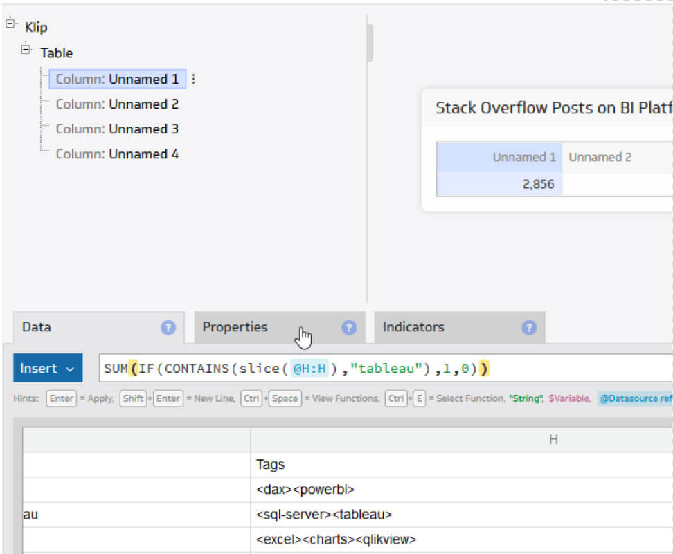
Switch to the Properties tab and rename the column header “Tableau.” This will change the name of the column the field list within the component breakdown on the left, and the title of the column on the central canvas.
Click down to another column on the left sidebar, and follow the same steps. Swapping the formula from “tableau” to “powerbi”, and repeat for the other platforms (switch to the “data” tab to put in your formulas).
To add a column, on the right there is a + and – section.
While Klipfolio does auto-save, you should “save” your work regularly. Use the dropdown on “Save and Exit” to “save” and stay on the same screen.
4. Adding a Line Chart
On the right, where the + and – section is, switch to the component tab (it has a tiny letter A, pie chart, bar chart, and gauge on it). Drag a Bar/Line Chart component onto the central canvas. I placed mine above the Table chart.
Aligning the datapoints for a line chart may not be entirely intuitive. The big tip is that you need to set the configuration in the Properties tab rather than writing it into the data formulas.
Click on the X Axis of your new Line Chart on the left sidebar and create your date formula. The date formula I used here is:

Column C is the creation date of the post. (Reminder simply click the column header in the data panel to get @C:C or a similar column reference in the formula bar.) When writing a formula you can hit the lightining bolt icon, which will evaluate your formula and return the first 300 results in a pop up. In this case you’ll see it return the year and month like so:
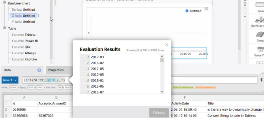
Click over to the Properties tab and make sure “Group repeating Labels” is checked and that Sort is set to “A to Z.” While you are here rename the axis “Date Month.”
Series is your lines for a line chart, or bars for a bar chart. Click on your starting Series and use a formula much like the one used in the table, just without the sum:

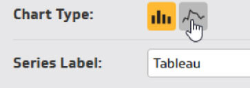
In the Properties tab rename the Series Label “Tableau” and make sure the aggregation is set to “Sum.” Finally change Chart Type to line by clicking the icon.
Add more Series by clicking on the + and – section near the top right, and follow the previous steps to add a Power BI and Qlik lines to your line chart.
Finally, I setup a date filter that effects the whole line chart. This is mostly because there is very sparse info for the first few years. Right-click on Date Month (X Axis) and click “Filter.” (You can also get to this from the Properties tab.)
You have a few different options here but I used “Condition” with “Match All” and set “does not begin with” for 2009, 2010, 2011, 2012, 2013 and 2018-07
The last one is to eliminate the partial month.
5. Adding a Pie Chart
Click on the Components section at the top right and drag a pie chart onto your canvas. Here we are going to reuse the formulas created in the Table chart by using a formula reference.
Simply typing a “!” in the formula bar will bring up a list of formulas you already written in other parts of your klip, and you can click on these.
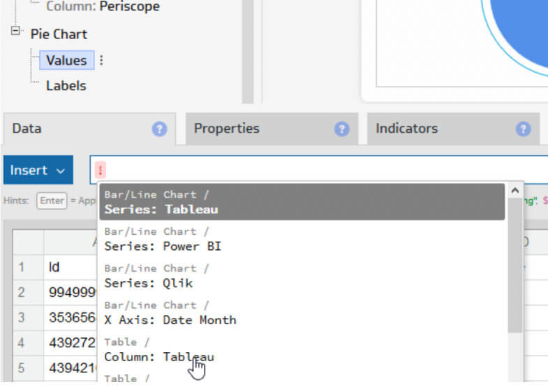
Click on Values of your Pie Chart component on the left sidebar and enter a formula like the following:

Click on Labels of your Pie Chart component and enter a formula that matches the above order:

(The order of your arrays have to match otherwise your labels will be incorrect. You’ll also want to use the same order as your line chart series, so that the colour scheme is identical.)
To get the labels of the pie chart to show both values and percentage, click on the “Pie Chart” header on the left sidebar. This will bring up a properties tab where you can check “show percentages” and “show values” as well as apply other configurations.
6. Embedding a Klip
There’s plenty more we can do and explore here but for now let’s embed the klip in a webpage. Click Save and Exit.
This will bring you to the Klips meta page. Just to the left of ‘About this Klip’, click on Embeds -> Set Up and Embed
This will bring up some configurations like the size, rounded corners and such. Once you have those set, click next then copy the embed code and then add it to a website.
What’s Next:
There is certainly more we can look at with our dataset. We can explore the propensity for other users to respond to a tag with answers and comments, the likelihood that an answer is accepted and the communities voting up of questions.
We’re working on a couple visuals to complement our initial klip. Feel free to check our work in progress. With Klipfolio you can make any dashboard a public link, so go ahead an take a look.
Need help with a Data Viz or advanced analytics project? Contact us.
Need Help with Your Data?
If you have a question, thought or concern about your analytics, you can schedule a free 1-hour consultation by clicking here. We’d love to hear from you.
Share the Love
If you enjoyed this post, please leave a comment below and share on your social networks. That would help tremendously in getting the word out and raising the visibility of the blog.
